
Upon joining Kenna Security as their first in-house creative, my main objective was to strategically and intentionally develop Kenna Security’s brand story and to refresh their look and feel across all expressions.
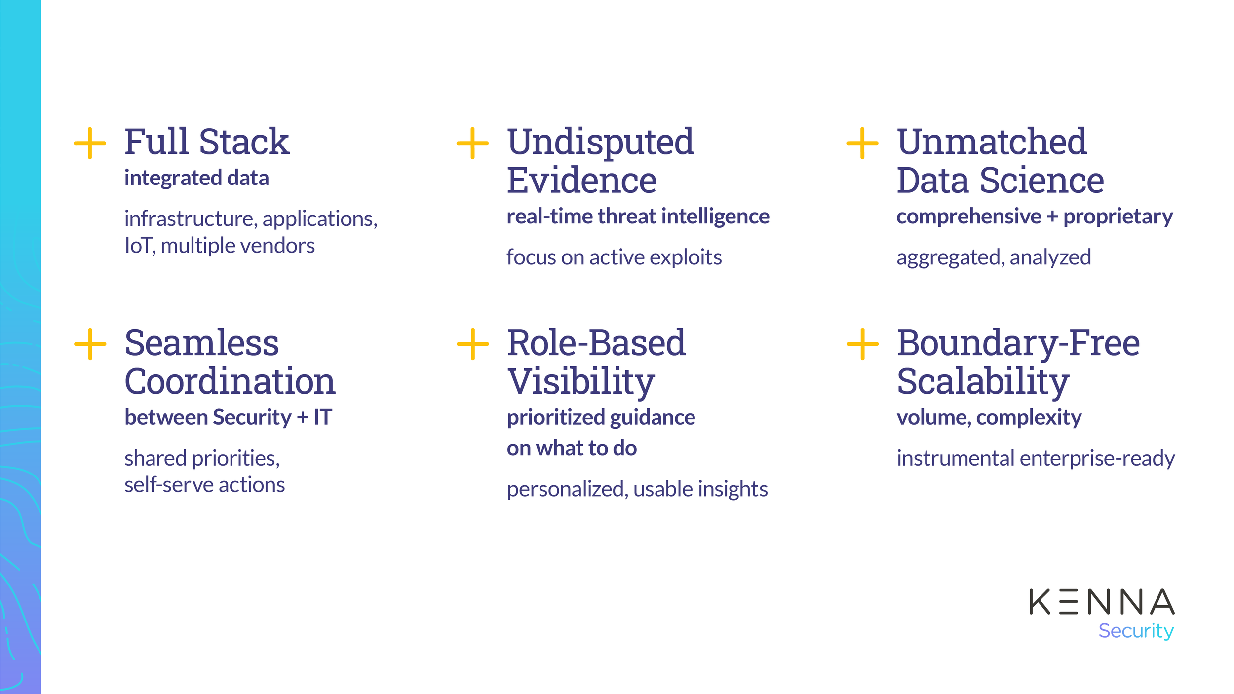
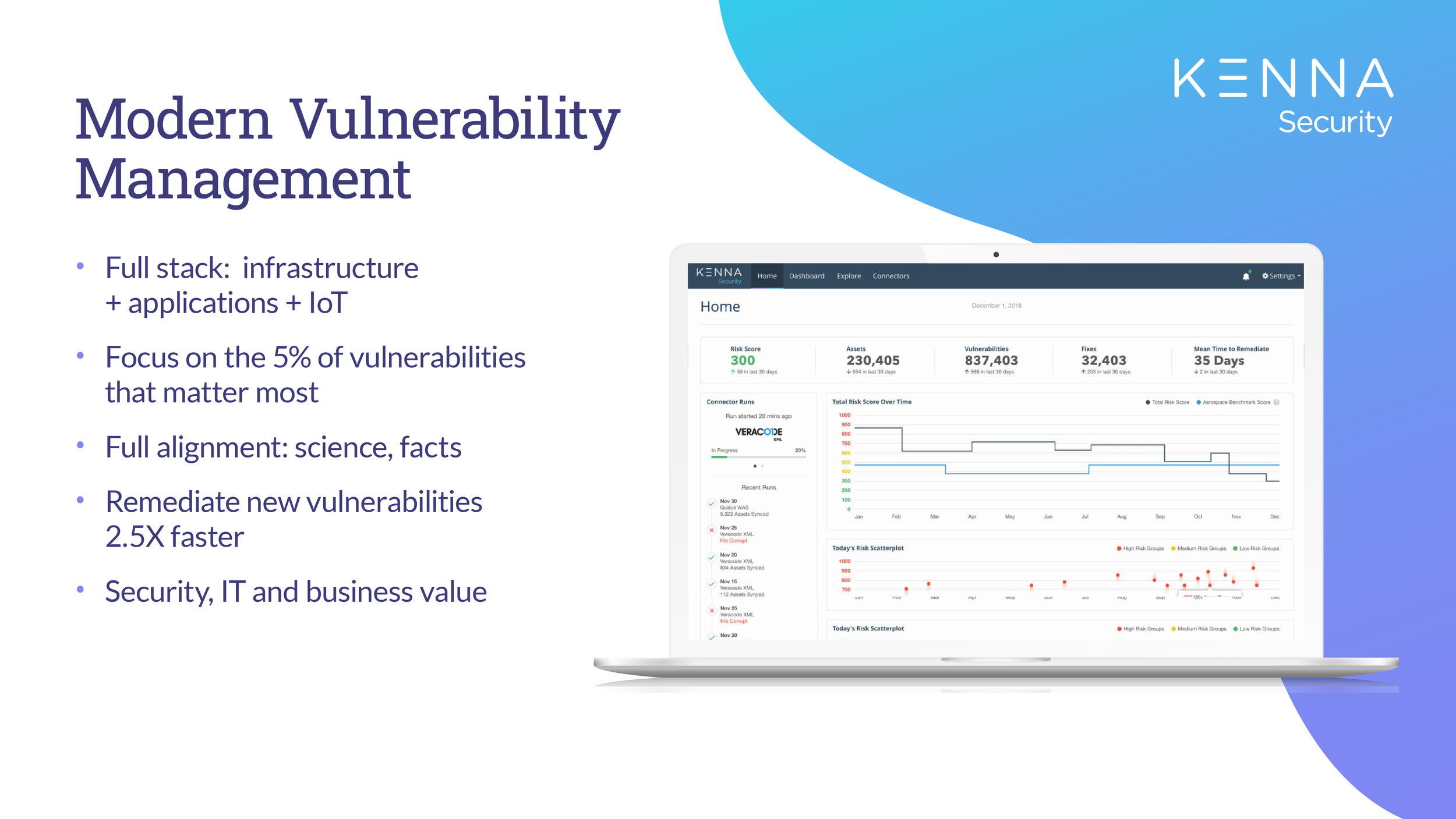
Kenna Security enables companies to efficiently manage and mitigate risk for their business. Kenna’s Modern Vulnerability Management model eliminates friction between Security and IT teams regarding what to patch, and provides clear prioritization based on real-time threat intelligence. This guidance is applied to each customer’s unique environment across infrastructure, applications, and IoT.
Below is an overview of the rebrand methodology and implementation across media and channels: web design, advertising, social media, print, events, video, and sales enablement.
Evaluating the Existing Brand
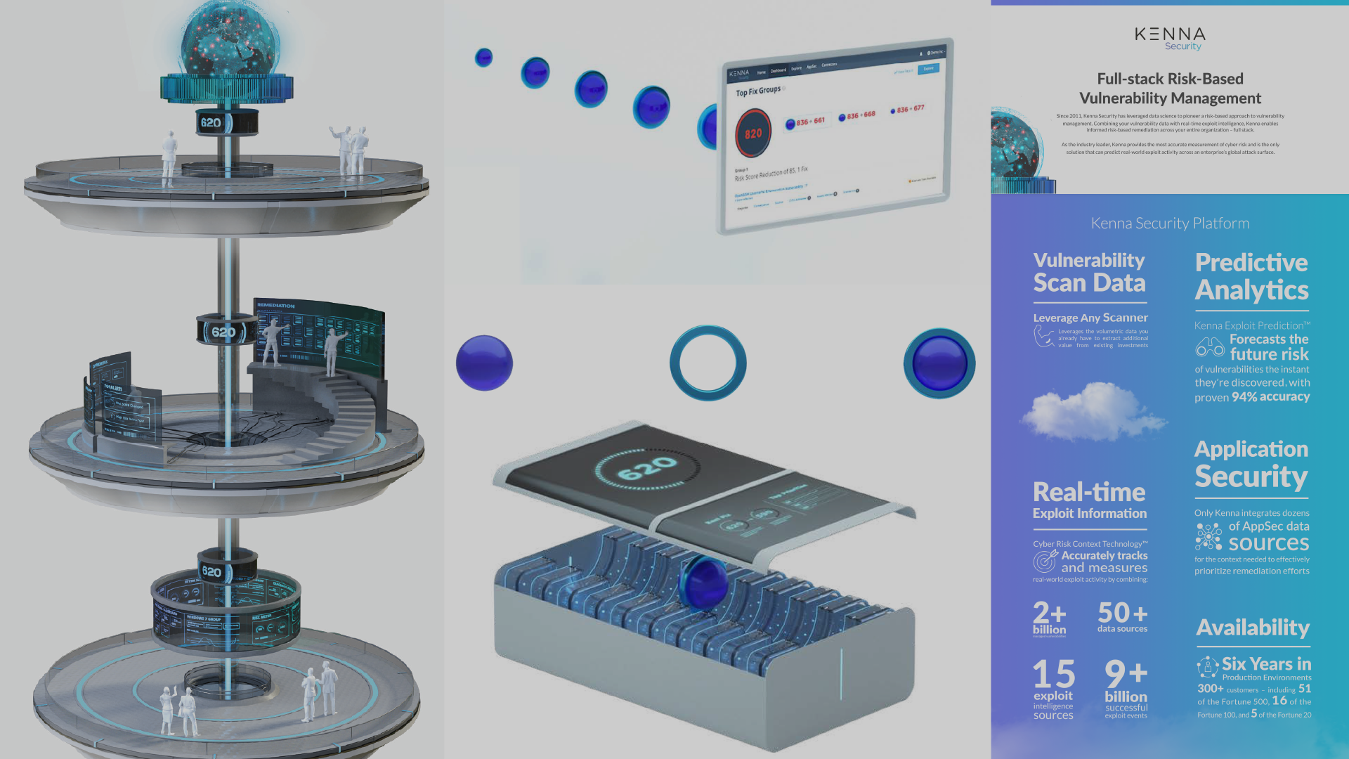
Within a few days of onboarding as Art Director it was clear that marketing desired a new look and feel. To have clear idea of what direction to take, I evaluated the existing brand centered around what was affectionately dubbed the “space elevator” and 3D blue spheres. The spheres comprised of a turquoise ring to represents the organization’s context and a royal blue ball to represent global threats. There was also a “risk score engine” to represent the underlying technology that drives the Kenna Security approach. Additionally, the color palate felt juvenile for the enterprise-level target audience and typography lacked both hierarchy and consistency.
During my second week, I participated in a two-day leadership workshop aimed to redefine Kenna Security’s positioning messaging and value propositions. The workshop was provided a foundational education that informed my discovery and research phase. Following the workshop, I engaged conversations with key stakeholders across Marketing, Sales, Product and UX to learn what the existing brand meant to them, evaluate what was and was not working and derive any ideals toward a future expression.
Developing the Brand and Design Elements
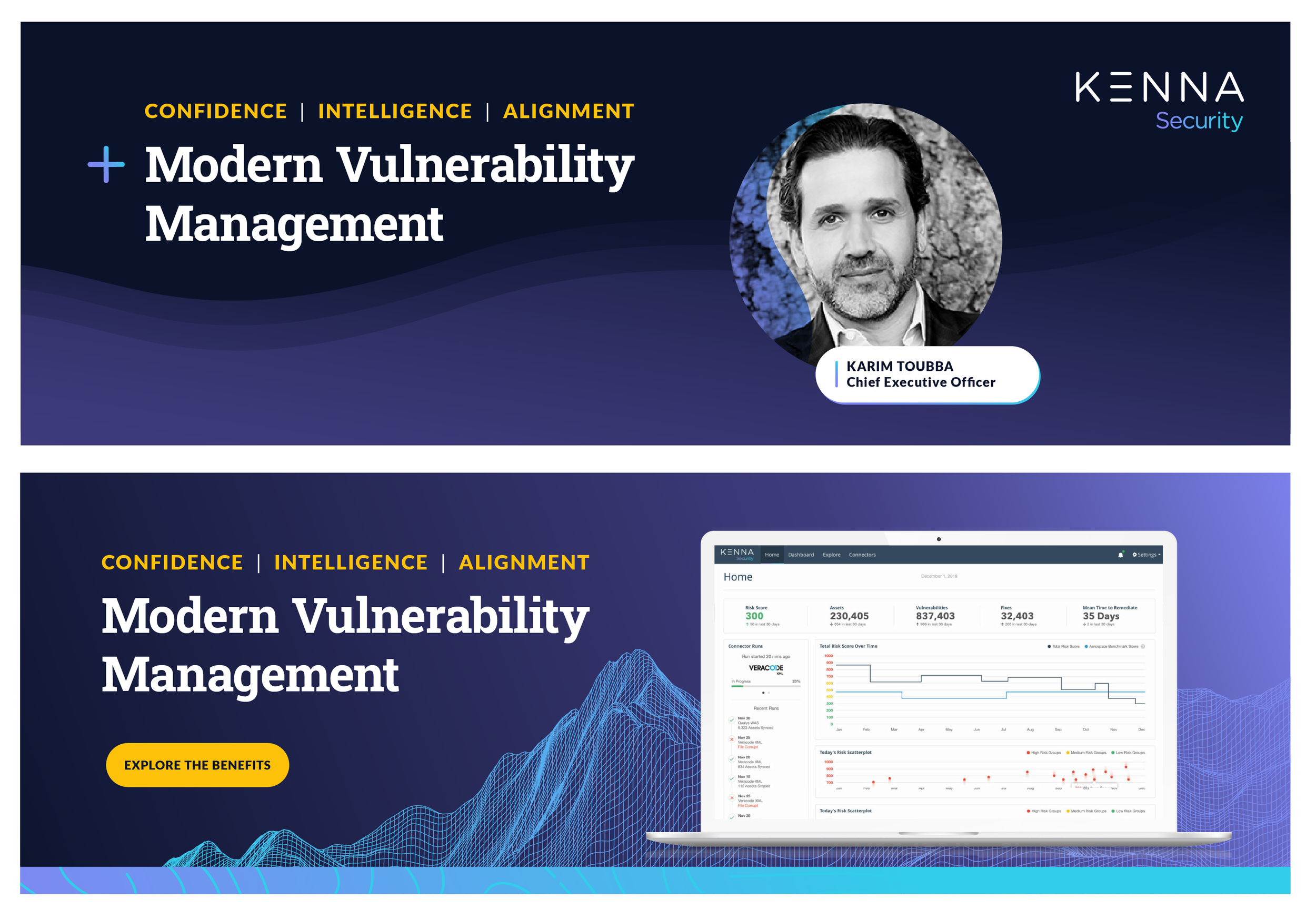
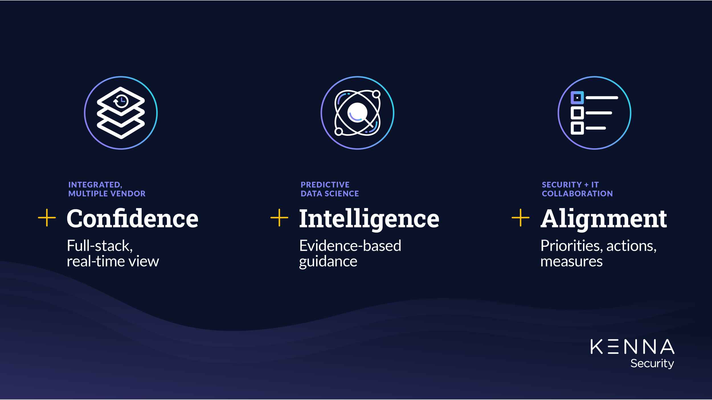
Over a two-week period, I threw myself into all things Kenna. General themes arose from my stakeholder interviews and positioning workshop: a desire for an enterprise-ready visual identity rooted in a story rich with adaptable symbolism tying to our three key differentiators: Confidence, Intelligence and Alignment
Kenna’s CEO, Karim Toubba had a few very clear requests. No threatening, fear-based visuals. No red or black. Avoid the hacker in a hoodie, dark tech vibe that is often seen within the cybersecurity space.
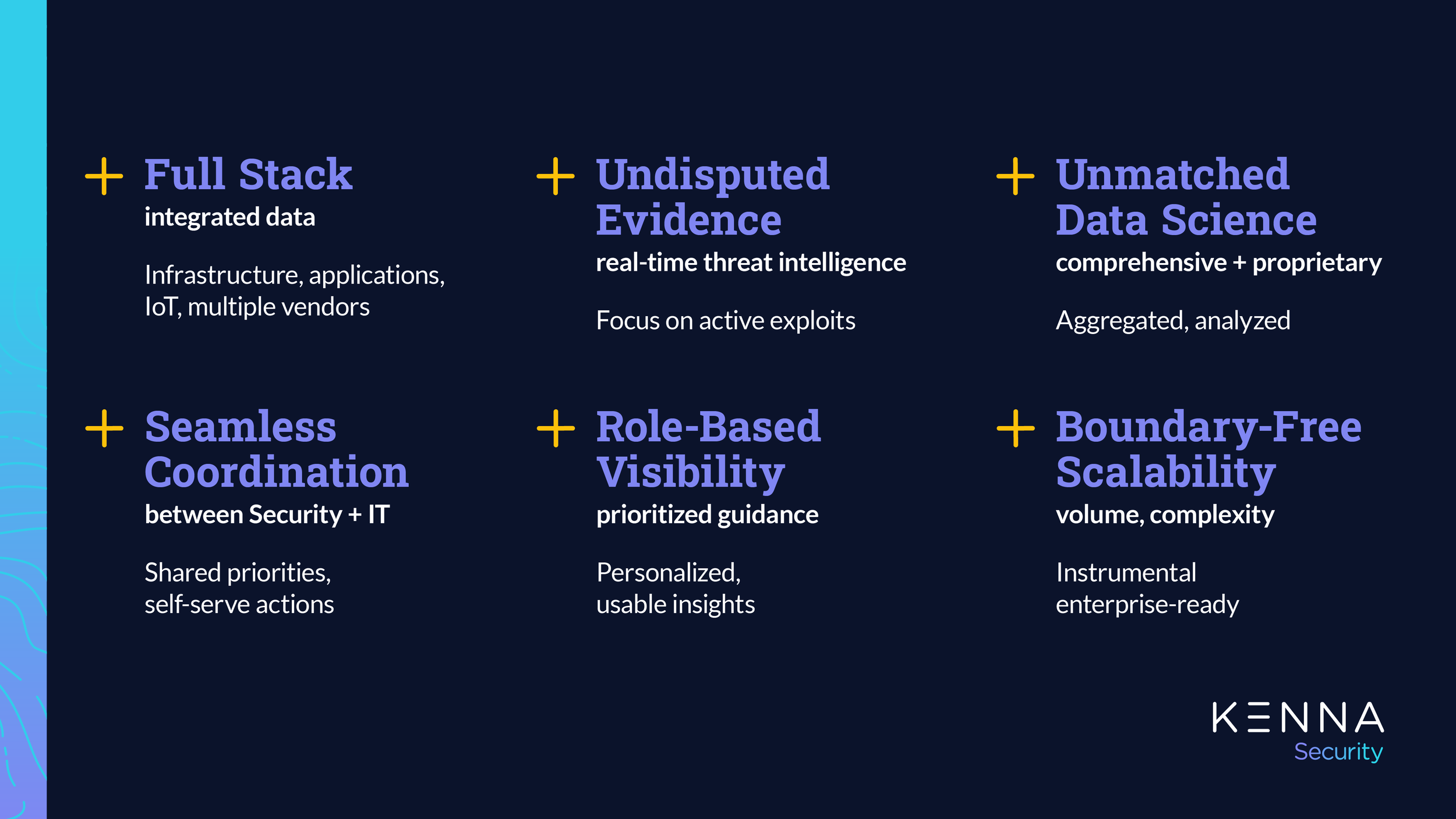
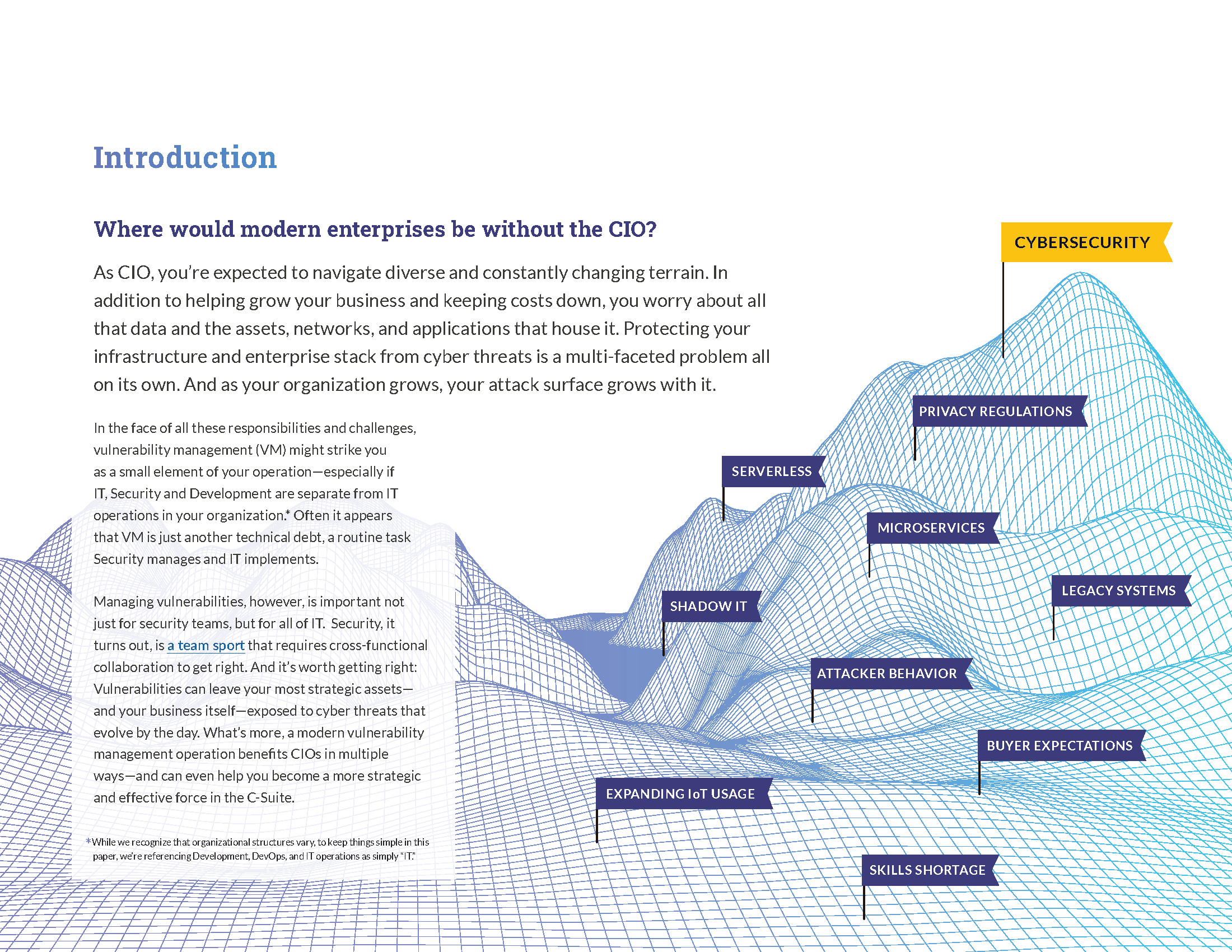
To steer clear of the aforementioned, I focused on the key differentiators and the way stakeholders spoke about Kenna Security. How Kenna provides customers a roadmap to security, unmatched guidance, and collaborative results. These qualities felt reminiscent of elements found in nature and guided me to developing the foundational brand elements: topography, mountains, and waves.
Defining Key Differentiators
Confidence
With Kenna, enterprises have full-stack visibility and a real-time view into risk across infrastructure, applications and IoT. Kenna integrates comprehensive vulnerability data from any source across their increasingly multi-vendor environment. Their data-driven remediation prioritization is based on each customer’s defined risk tolerance level and unique environment.
Topography
Organic line drawings represent evolving growth and visibility. With the unknown terrain of cyber threats, Kenna Security provides a roadmap to success and vulnerability management.
Intended use with gradients as a textural element within backgrounds.
Intelligence
Kenna provides customers with guidance based on evidence of real-world threats. Their predictive data science applies machine learning and NLP to uniquely curated and customized threat data sets. This is intelligence you simply can’t get elsewhere. Kenna assess every vulnerability for every asset in your environment, tuned to your risk goals, so you always know what matters.
Mountains
Tech infrastructure inspired line drawings represent foundational stability, scalability, exploration, and growing vulnerabilities threat over time.
Kenna provides teams trusted expertise and effective tools to reach their metaphorical summit by following a customized path.
Intended use as a hero image, at least as the brand initially rolls out. One primary mountain illustration with two for secondary use.
Alignment
Kenna drives collaboration between Security and IT teams. Kenna eliminates the friction between Security and IT about what to patch, empowering IT teams with self-serve capabilities and freeing Security teams to focus on oversight, reporting and exception handling. The Kenna Security platform is used by the world’s most demanding companies and is built to scale without constraint.
Waves
Organic solid shapes, both singular and layered, represent full stack coverage, and marry the fluid nature of both vulnerabilities and Kenna’s seamless coordination to general collaborative results.
Intended use with gradients as a background element and supportive graphic treatment.
Visual Proof-of-Concept
Color and Gradient Development
The original color palette was teal, lavender and gray accented with lavender to teal gradient which lacked consistency and use case.
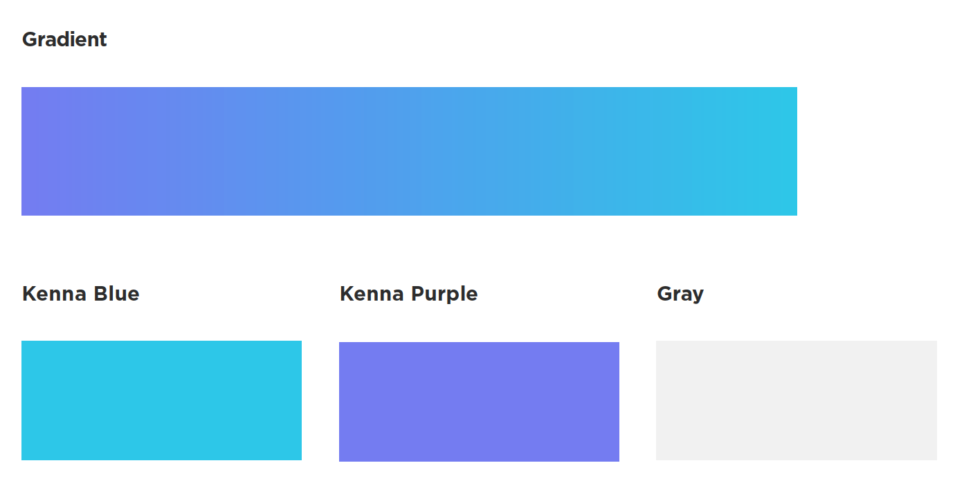
My recommendation was to maintain the original palette for familiarity and incorporate additional colors to for greater maturity, depth, and variance. A richer palette to represent confidence (violet), strength (indigo), and optimism (sungold). I also replaced the original light gray with white and included opacities as a neutral replacement.
Original color palette
Color Use Cases
Violet and indigo for type legibility and as a neutral background color to support the bright pops of color with the teal, lavender, and sungold.
Sungold as an intentional and limited accent color or as a call to action.
In addition to the lavender teal gradient, I created two with the violet and indigo for added richness and variance.
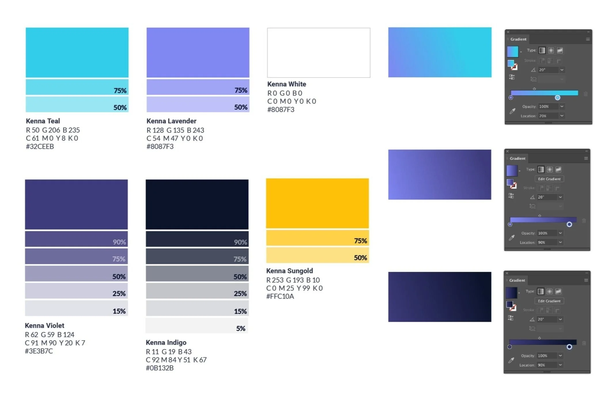
Refreshed color palette
Typography
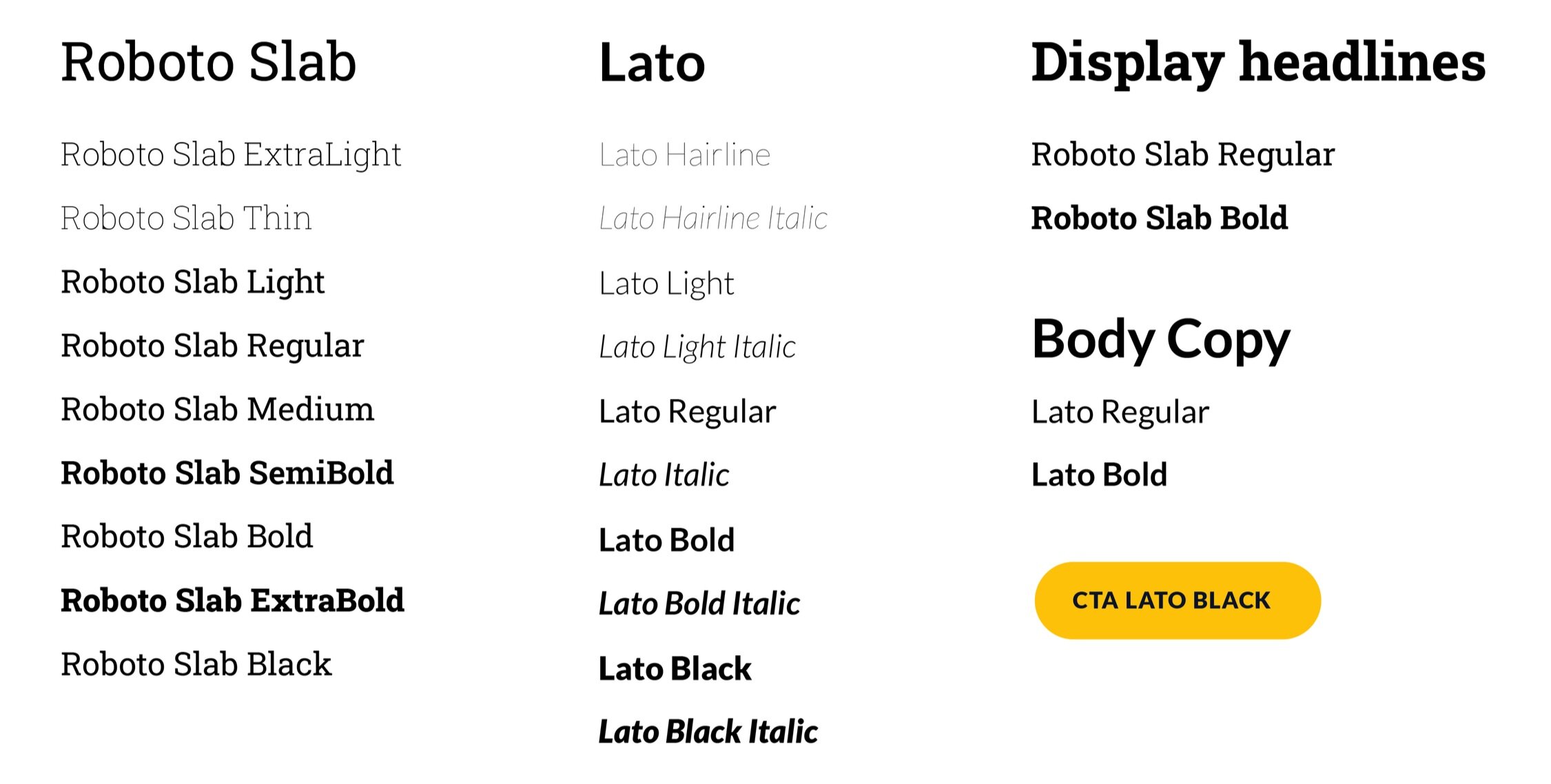
Roboto Slab + Lato
My first type prioritiy was replacing Gotham due to pricey licensing and general design overuse. Roboto Slab was the agreed option as an open-source slab serif. With a modern but technical feel, it provided dynamic weight variety for use across a variety of formats.
Lato was the existing typeface for body copy and opted to keep it with scaling and production in mind. To create a clearer hierarchy, I expanded the varied weights and encouraged content to be intentional with casing.
Together, Roboto Slab and Lato created an approachable and confident balance.
Photography
It was really important to me that we utilize photos of both real Kenna employees and if stock is necessary, to select images that are reflective of our workforce and process.
In terms of treatment, photos featuring engaged faces treated in black and white with mindfulness to rich blacks. When using as a social card or slide deck, my recommendation is to include a multiplied gradient overlay to provide dimension and depth as well as enhanced legibility and a tie back to the brand colors. Additionally, keeping with the organic wave shapes are a nod to Kenna’s all-encompassing solution.


Marketing Collateral Development
Designed and deployed PowerPoint and Google Slide templates across the organization. These are samples of some of the initial slides and social cards.


E-books, Data Sheets, Solution Briefs
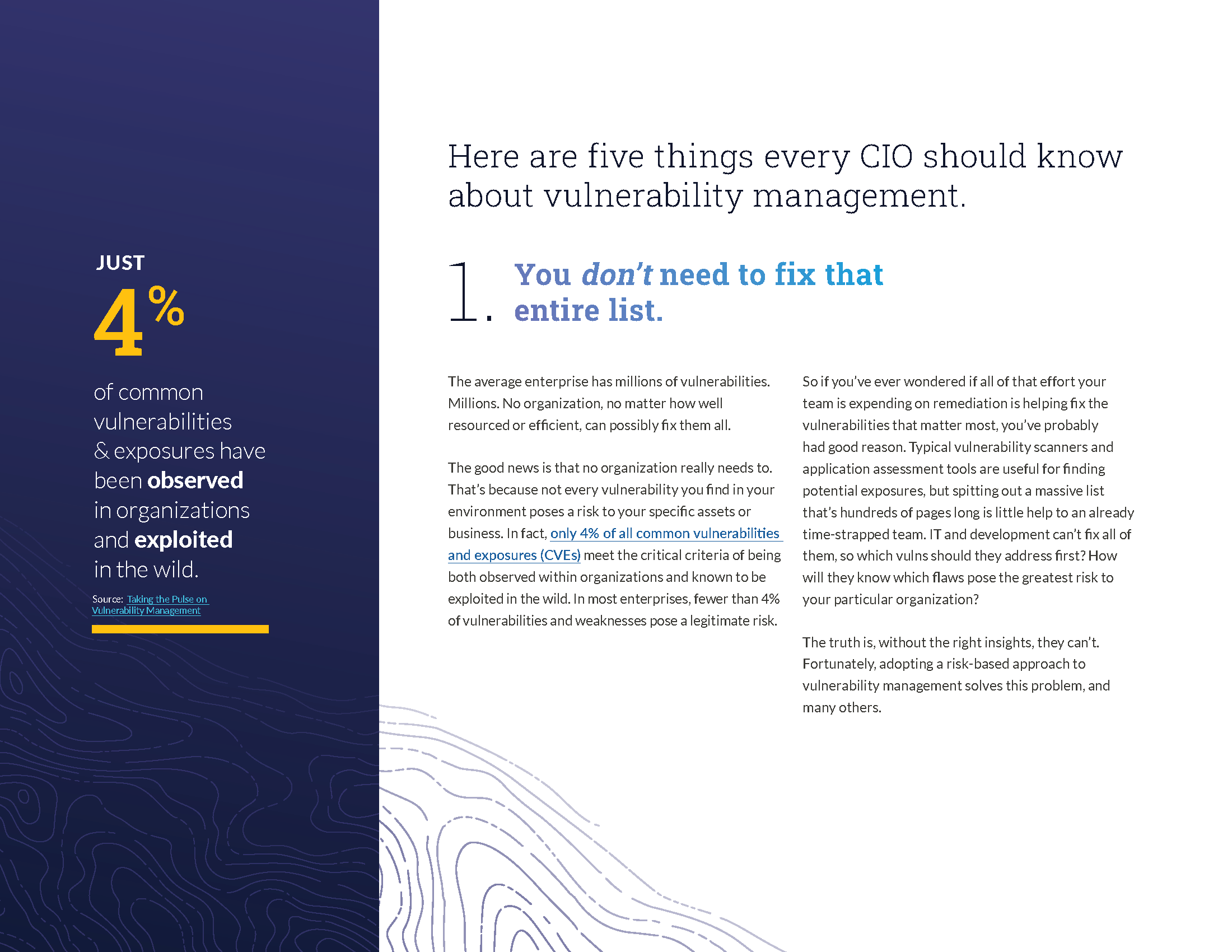
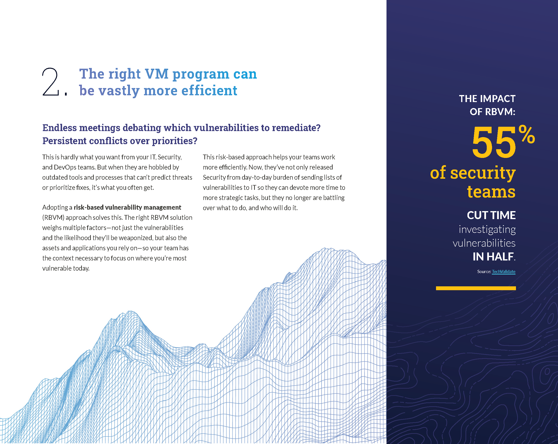
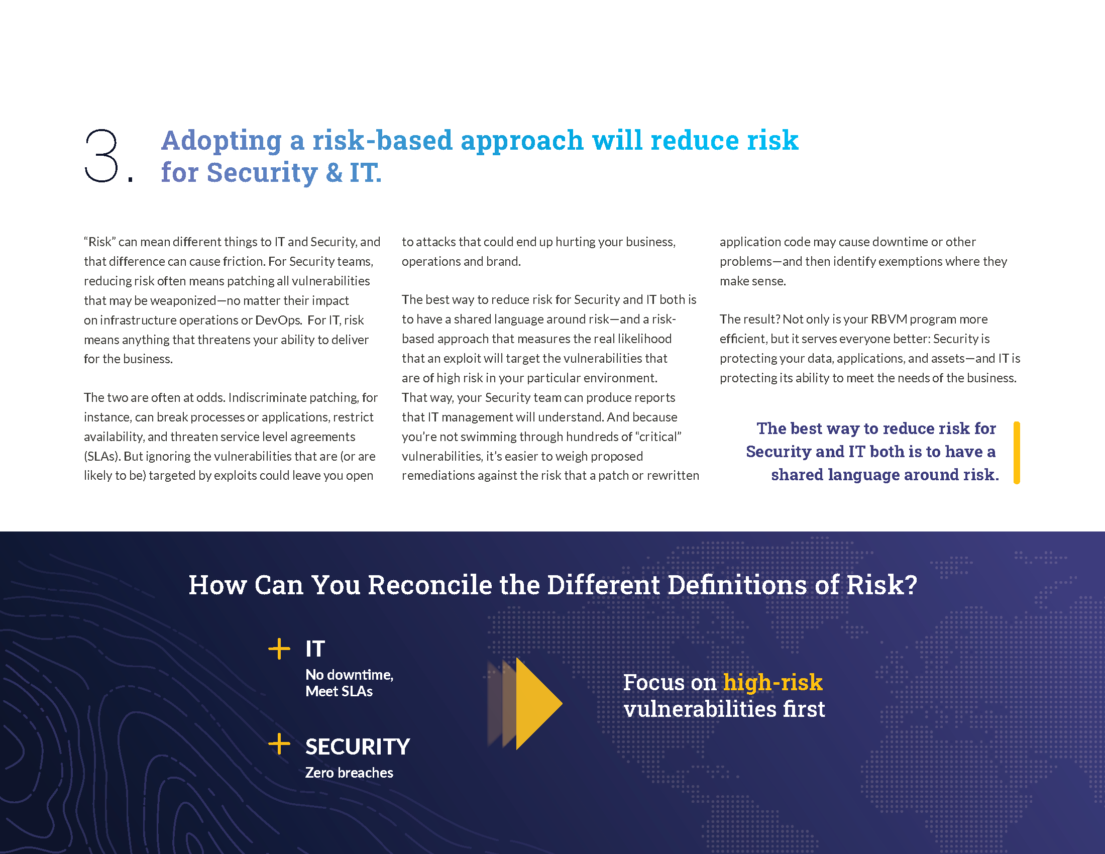
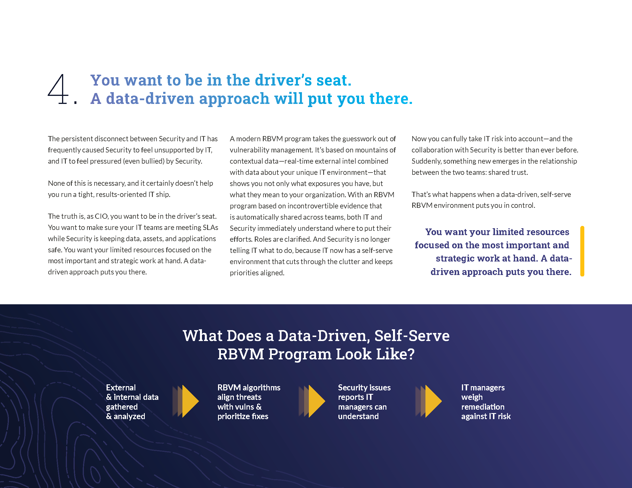
Demand Gen and Sales Enablement is a key part of any startup’s pipeline. One of Kenna’s key personas and target decision makers are CIOs. To target this audience, we created ungated assets including this “5 Things Every CIO Should Know About Vulnerability Management” e-book.

Infographics
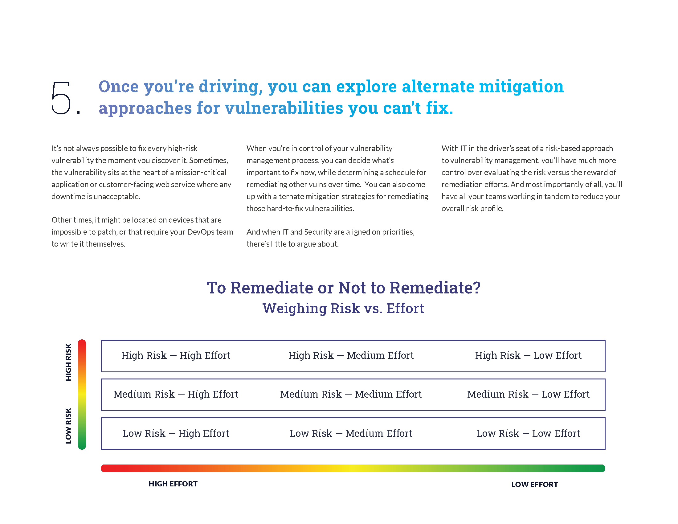
Kenna Security was founded on a few basic propositions: Companies have more vulnerabilities than they can patch; but most vulnerabilities present very little risk. By harnessing data, we can help companies decide which vulnerabilities really matter, and they can allocate resources more effectively. The data below comes from Kenna Security’s Prioritization to Prediction research, which analyzes a vast amount of data to create a truly objective analysis picture of the security practices at large companies. For many of these numbers, we relied on a sample of data from over 300 Kenna customers, along with external data from public and private intelligence sources as displayed in some of infographics below.
As part of the design process, I worked with technical stakeholders to validate that the visual interpretations are accurate and digestible by a technical audience.
Focus on the 4% of Vulnerabilities That Pose Risk
Published CVE Count Increases Trifold Following 2016
No Matter the Size, Organizations Can Only Patch About 10% of Vulns
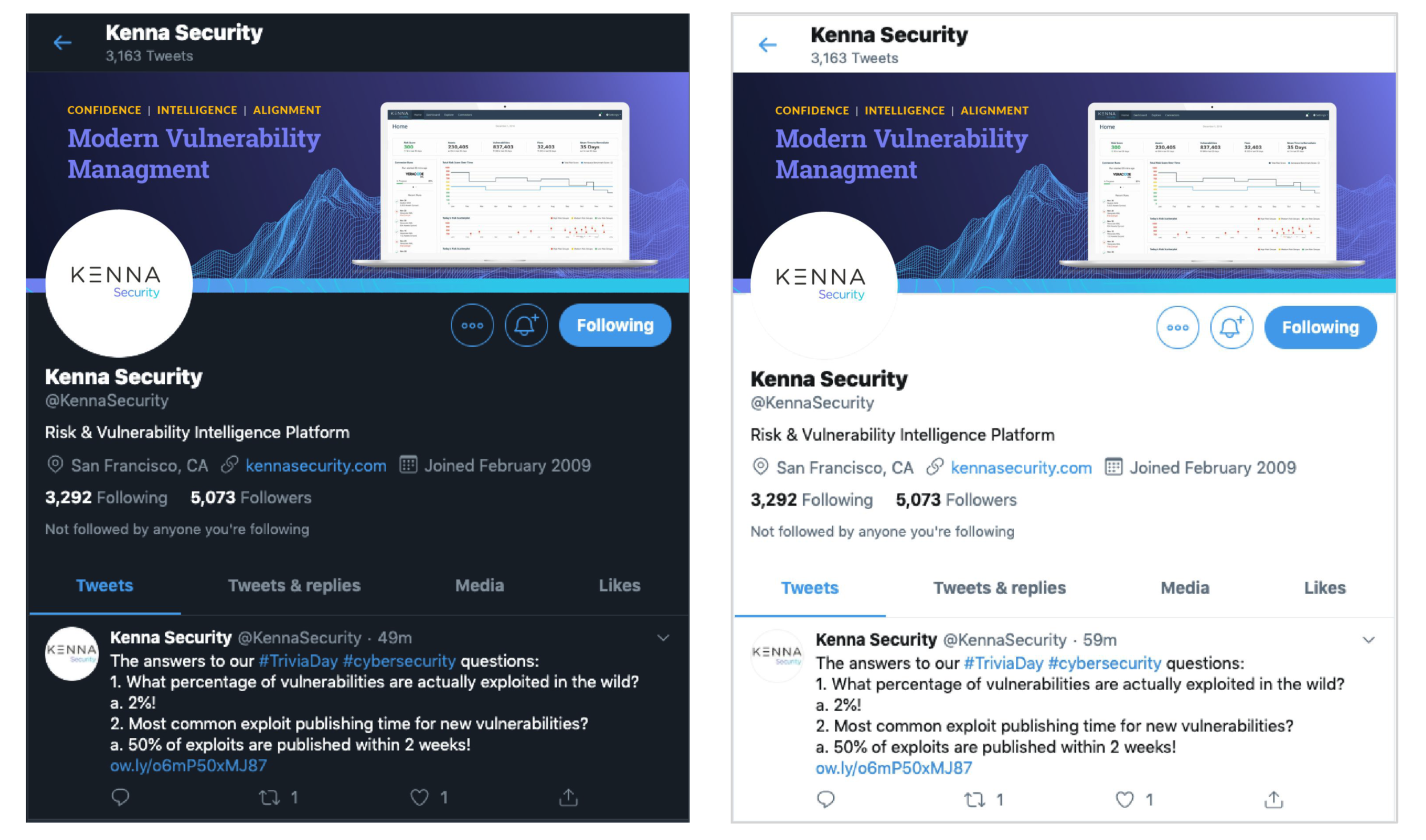
Social Media Assets
Kenna Security needed a consistent look across social platforms. Below are examples of both Twitter and LinkedIn. Assets and templates were distributed to across the org along with a social media guide that included social media best practices and recommended tone of voice.

“Why Kenna Security?” Brand Video
Telling the story of “Why Kenna Security?” in a roughly two minute video for initial use at the RSA Conference. I was responsible for script development, storyboarding, and art direction in collaboration with Content Marketing and freelance video editor Angie Milosevich.
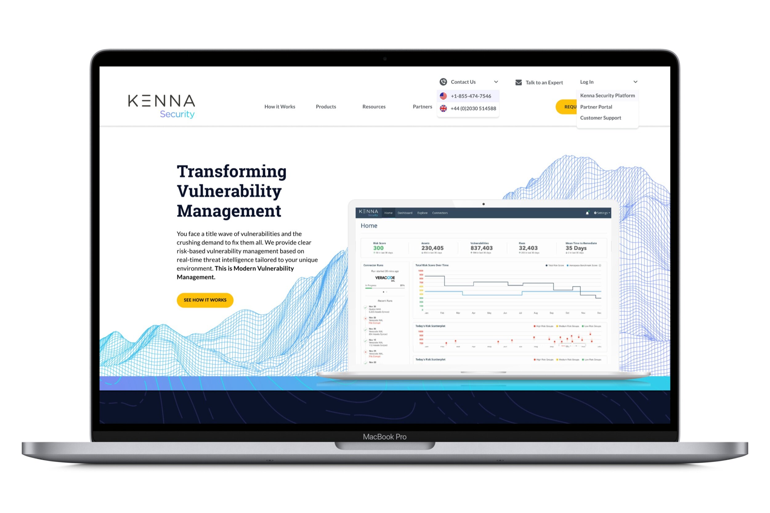
Website Redesign
To align with the new brand creative, the website needed to be redesigned. One of the priorities for the homepage was to increase conversions. Within one month of the homepage Q1 launch, we saw a 1650% increase in homepage conversions. The whole website is slated to go live at the of Q3 2020. All assets were created in Figma.
Project Objective
To refresh the website look and feel and to create a platform that supports why Kenna is the leader in RBVM.
Increase conversions.
Challenges to Solve
Establish Kenna brand look and feel
Increase brand awareness, engagement, traffic and conversion
Update and simplify navigation
Clarify value props and key differentiators
Why Kenna Security?
What is Risk Based Vulnerability Management (RBVM)?
UPDATE content throughout website
Product pages, How it Works, Resources, Kenna History, Customer page, Demo, Security, Partners
ADD content throughout website
Add Solutions, Pricing Page, Thought Leadership
Target Audience
CISOs, Senior Director Executives | Sell in needs to be higher vs lower | Users tend to be security analysts, IT/Ops
Deliberate increase in CTAs throughout the homepage. Within one month of launch, we saw a 1650% increase in homepage conversions.
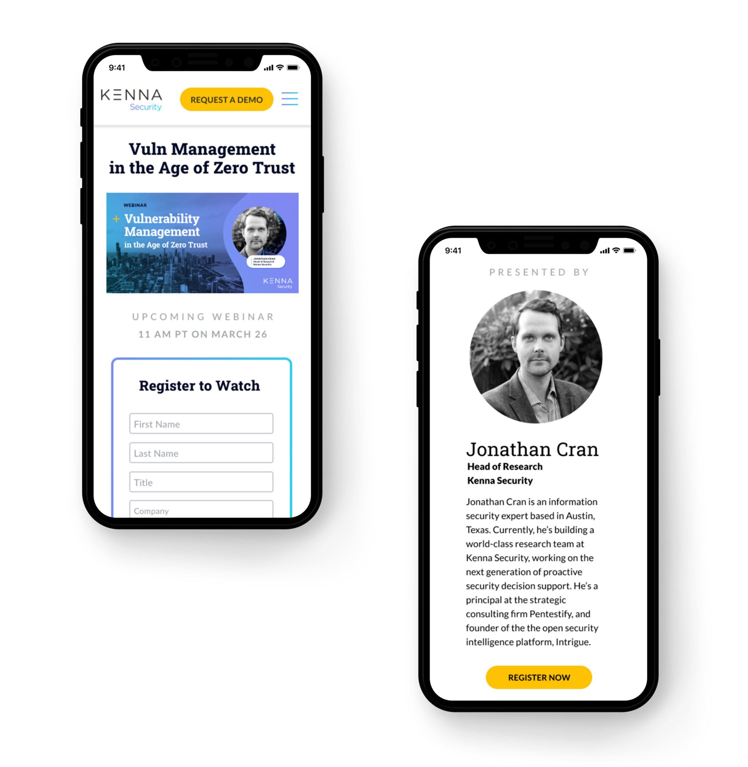
Webinar Email Campaign and Registration Landing Page
Webinars are a critical part of Sales Enablement for Kenna Security. With this in mind, I wanted to create a more engaging landing page that highlight the speaker’s expertise and the value add someone would experience by joining a webinar. Within one month of launch, we saw a 36% increase in webinar registrations.
Within one month of launch, we saw a 36% increase in webinar registrations.
Design System
“Yasmin was able to rapidly concept out a whole new brand direction that maintained the core values and connection to our existing branding but bringing it to a new level of cohesiveness, polish, and execution. Oh, and she did all this within two months’ time from joining the company while balancing numerous tactical projects.”
What I Worked On
Strategy
Concepting
Engagement
Research
Content Development
Copywriting
Branding
Mood boards
Identity Development
Color Research
Typography
Hierarchy
Collateral
Guidelines
Design
Art Direction
Direct Mail
Social Graphics
Environmental
Presentations
Digital
Wireframing
Design systems
UI Design
Mobile
Video
Gifs